The Subtle Psychology Menus Deploy from the Start
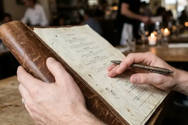
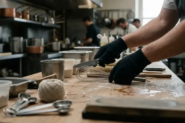
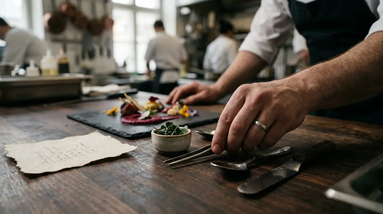
I recently took a seat at a highly anticipated downtown bistro. Before the server even approached to pour water, the heavy cardstock in my hands was already doing the heavy lifting. Reading a dining experience this way starts by treating the menu as the restaurant's first scripted interaction, not as a neutral inventory. Opening statements set the tone before any dish arrives.
Our ongoing partnership with regional hospitality analysts gives us a working baseline for how these opening moments operate. We classify the opening as deliberate framing when about 30% or more of the first visible copy is mood, provenance, hospitality language, or house-positioning text rather than dish specification. This text is not filler. It is a calculated attempt to shift your mindset from a hungry commuter to a receptive guest.
Our experience showed that timing is everything in this initial phase. You must evaluate the first 10–20 seconds of menu exposure, before drink orders, server suggestions, or table conversation can reset expectations. In that brief window, the restaurant establishes its authority and justifies its price point through sheer atmosphere.
Key Takeaway: The first paragraph you read on a menu is rarely about the food. It is about establishing the emotional context for the money you are about to spend.
Wording Choices That Steer Appetite and Perception
Why does a plate of "Pan-Seared Dayboat Scallops" command a higher price than "Scallops, cooked"? Sensory language increases perceived value. Story elements create an emotional connection to dishes that plain text simply cannot achieve.
One method for evaluating this is comparing each dish name against a plain-control version: ingredient, cooking method, and portion only. We flag a dish description as a perception-shaping entry when it contains 5 or more concrete cues across texture, aroma, origin, preparation, or maker identity and carries a price close to 10% above the section median. Sensory terms, origin cues, and short story fragments are counted only when they actively inflate the perceived effort behind the plate.
Community observation suggests that you cannot judge these wording effects based on a single visit. For a fair comparison, you must review wording effects across roughly 13–27 service days rather than a single dinner period, because weather, reservations, and specials can distort one-night ordering patterns. A rainy Tuesday might drive diners toward comfort food regardless of the adjectives used, but over a month, the "hand-foraged" and "slow-braised" descriptors consistently pull higher order volumes.
The Role of Provenance
Naming the farm or the fisherman is a specific tactic. It borrows credibility from the supplier and transfers it to the kitchen. When you see a specific farm named, the restaurant is signaling transparency, which subtly encourages you to lower your guard regarding the final bill.
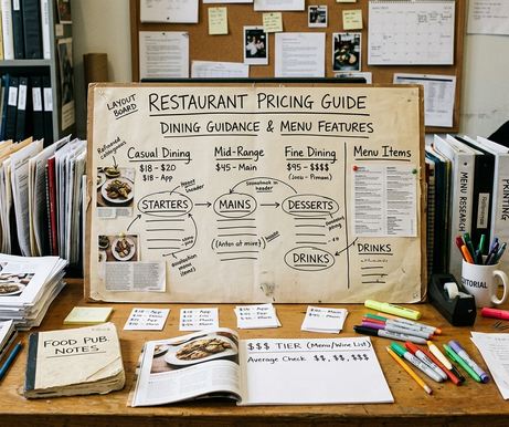
Pricing Structures That Influence Selection Speed
Most diners open a menu and immediately look for the prices to establish a comfortable spending tier. Menu engineers anticipate this behavior. Anchor prices direct attention to target items, while the removal of currency symbols reduces spending hesitation.
We map the highest visible price first, then check which nearby item appears designed to look reasonable beside it. We use an anchor flag when the highest item in a section is close to 40% above the section median and appears within 3 item rows of a mid-priced dish the menu seems to spotlight. The best placement for an anchor is right next to the dish the kitchen actually wants to sell in high volume. Suddenly, a forty-dollar chicken looks like a sensible compromise next to a ninety-dollar steak.
During practice, we run a selection-speed check. We track the time from menu open to first serious shortlist over an around 2–5 minute range. Faster shortlisting after a high anchor suggests the menu has narrowed comparison work. The diner stops looking for the cheapest item and instead settles on the "safe" middle option.
Pro Tip: Notice when a menu drops the dollar signs entirely. The removal of currency symbols is treated as a friction-reduction tactic, subtly disconnecting the number on the page from the money in your wallet.
Layout Patterns That Control Eye Movement
Where do your eyes go first when you open a two-page spread? The layout section follows the likely eye path: opening panel, boxed items, white-space clusters, section headers, then price columns. Prime real estate placement highlights profitable plates.
The eye naturally seeks structure—a reality menu designers exploit through strategic boxing. We mark an item as layout-prioritized when a box, border, or isolated callout occupies roughly 10% of the visible panel while containing fewer than 7 dishes. By isolating a few items in a sea of text, the restaurant dictates your visual hierarchy.
Member feedback indicates that the eye-flow audit is fairly predictable. We judge the first scan path over close to 15–30 seconds, then compare it with the second pass after diners begin matching price, hunger level, and dietary constraints. The first pass is entirely controlled by the graphic designer. The second pass is where the diner regains control.
Recognizing These Tactics as a Customer
Awareness helps balance desire with actual preferences. Menus reveal restaurant priorities beyond flavor. The customer-facing approach reverses the menu-engineering process: first identify what the restaurant is pushing, then test whether that push matches your actual appetite.
There is no guaranteed way to ignore a well-crafted menu, but you can slow down your decision. We use a strict preference check. Before ordering a highlighted item, require 3 concrete matches with personal appetite, such as preferred protein, cooking method, spice level, portion size, or side pairing. If the item also carries a roughly 15% premium over nearby alternatives, pause before committing. You might feel an immediate pull toward the dry-aged ribeye—a craving manufactured by clever placement.
Use a decision reset. Give yourself about 5–10 minutes between the first craving response and the final order when the menu uses boxes, origin stories, or high-price anchors heavily. Let the initial psychological push fade.
Warning: Do not over-analyze every piece of paper you are handed. Failure case: a tiny handwritten menu with around 9 dishes may reflect ingredient availability and kitchen capacity more than deliberate psychological sequencing. Context-dependent variation is real. Visitors choosing a celebratory dinner may respond positively to storytelling and premium anchors, while weekday regulars may scan straight to familiar dishes and ignore most framing.
These tactics matter less on fixed tasting menus, short chalkboard menus, and counter-service boards where availability, speed, or set progression outweighs comparison shopping.
Diner Menu-Literacy Check
- Read the first 7 visible lines before looking at prices; identify the mood the restaurant wants you to enter.
- Find the highest-priced item in each major section, then ask which nearby dish it makes look safer or more reasonable.
- Count the adjectives on the dish you want to order. Are you paying for the ingredients, or the story?